Neo Pop Rebrand
CLIENT
Neo Pop Beverages
YEAR
2026
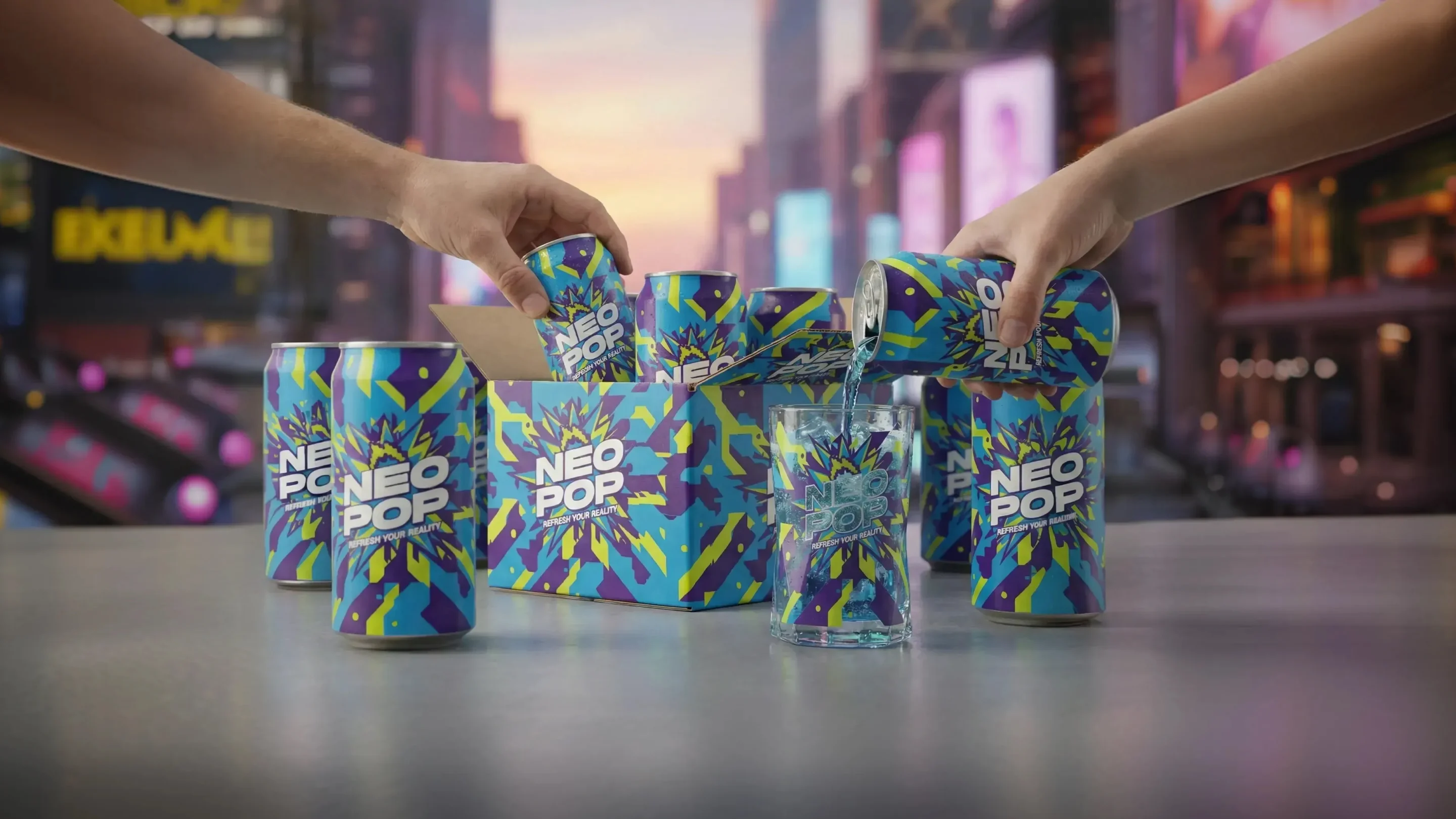
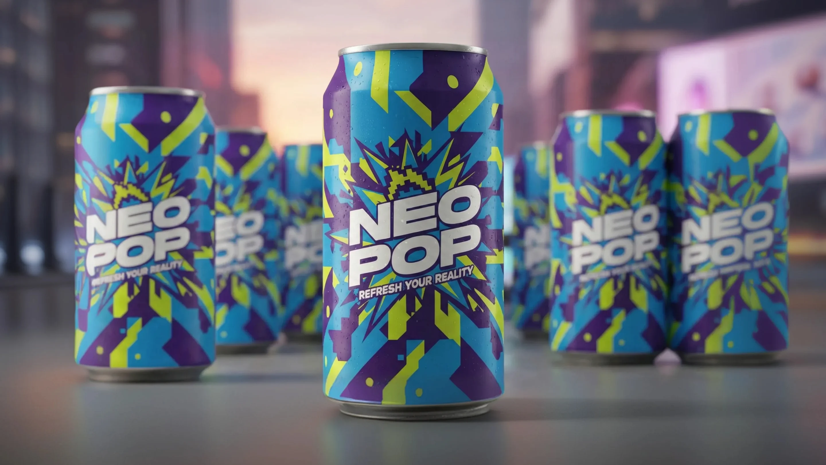
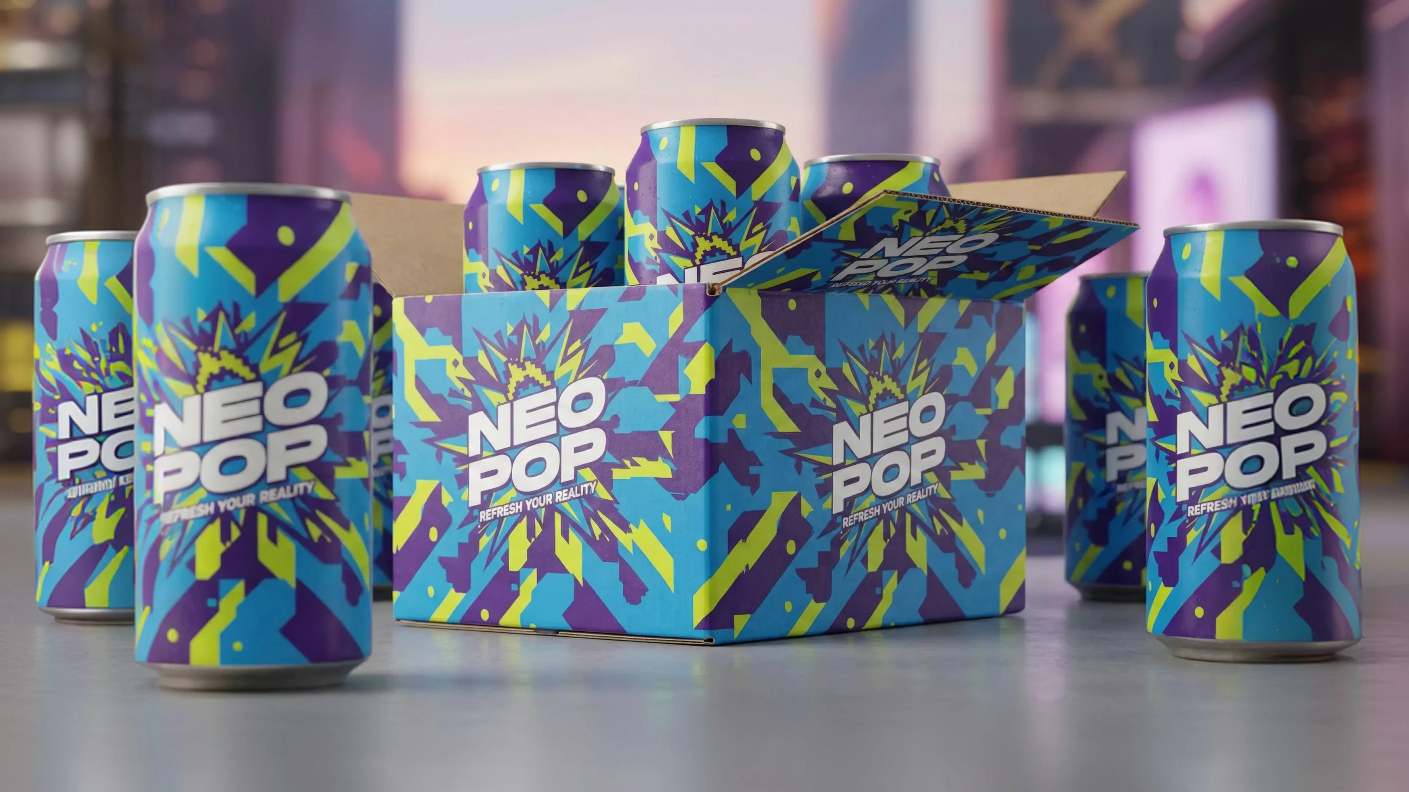
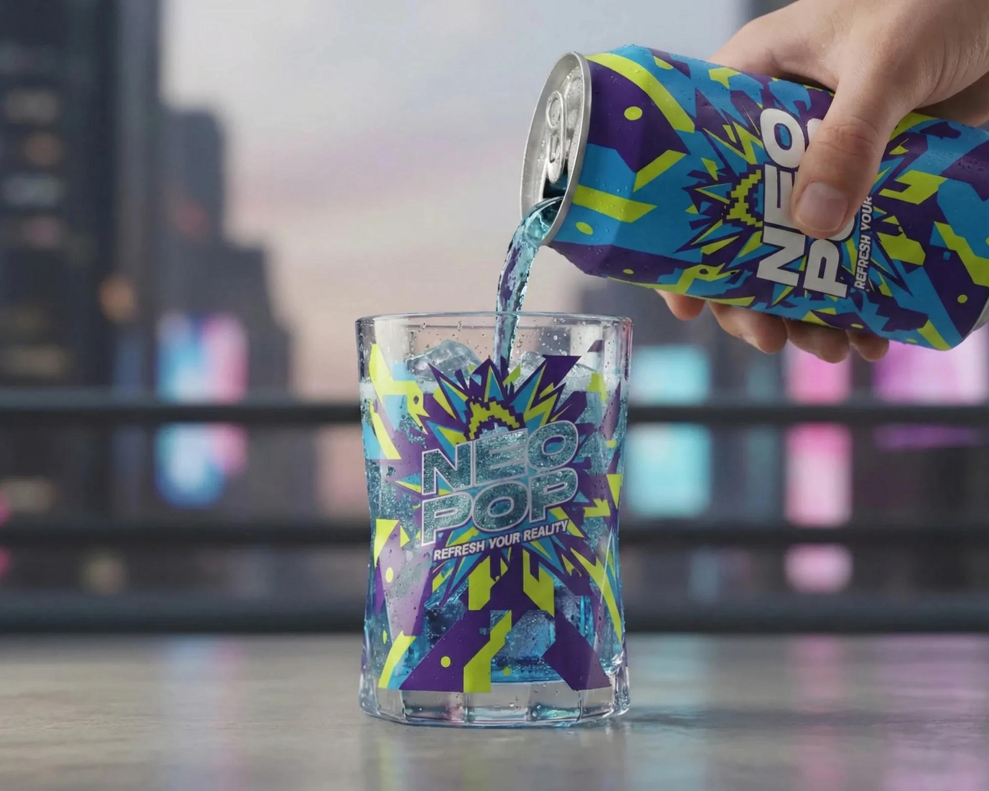
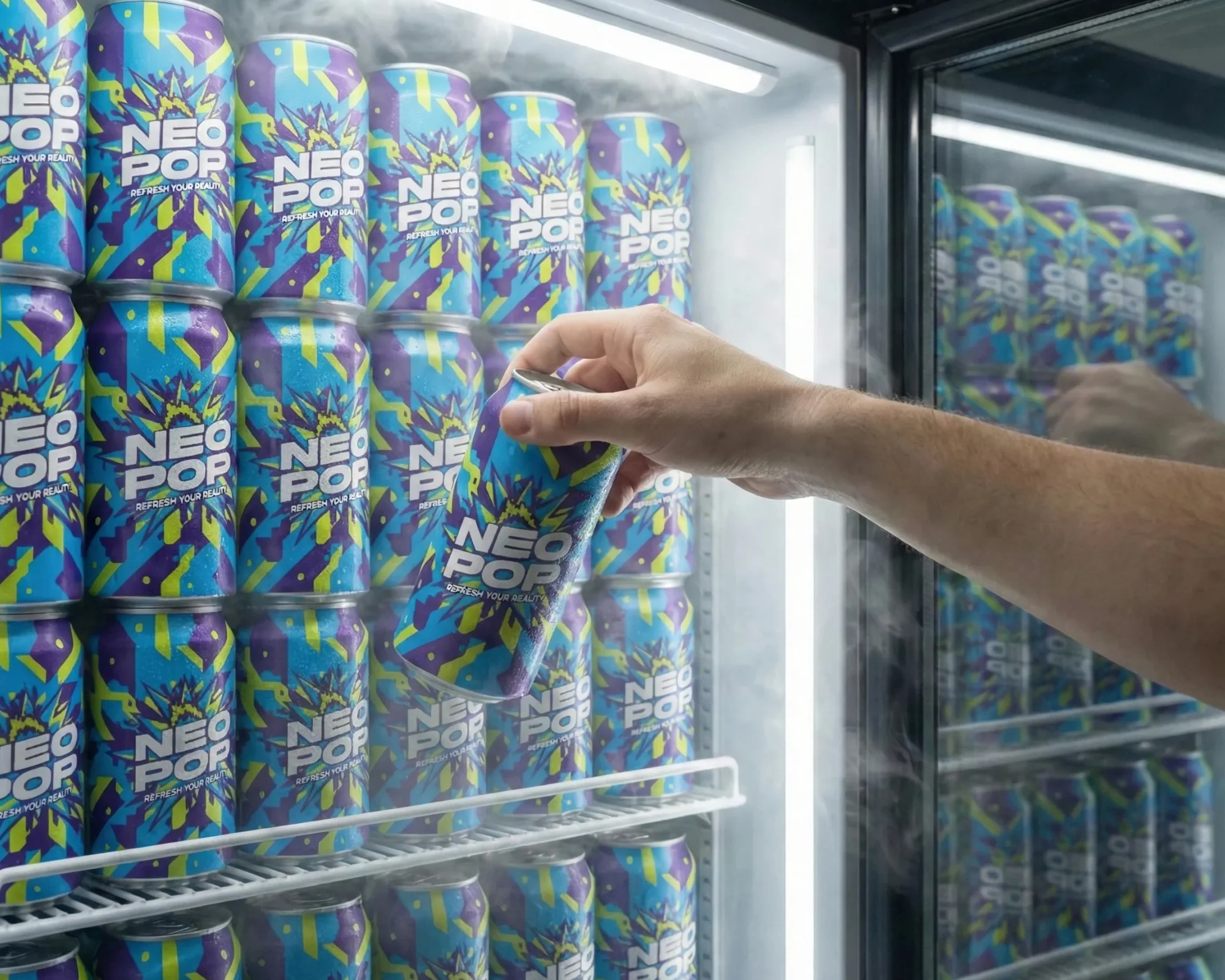
Neo Pop, a carbonated beverage brand, needed a visual overhaul to target a younger, Gen Z audience. I executed the full packaging design and brand identity, creating a high-energy, abstract look that instantly stands out on the shelf.
PROJECT TYPE
Collaboration with Veridian Agency
INDUSTRY
Food & Beverage
MY SERVICES
Packaging Design
Brand Identity
Illustration
TOOLS USED
Adobe Illustrator
Adobe Photoshop
Adobe Indesign

The Challenge
Neo Pop was struggling with an outdated image that failed to resonate with the youth market. The goal was to discard the legacy look and adopt a high-impact, disruptive visual identity that was loud, abstract, and instantly shareable on social media platforms.
The Solution
I developed a vibrant, abstract illustration system with a dynamic color palette that defined the new brand. This system was integrated into the packaging design for all can sizes. The design language is built to be flexible, allowing for easy adaptation across different flavors and limited-edition runs.
The Result
The Neo Pop Rebrand successfully positioned the product as an energetic and modern choice. The striking new visuals led to strong engagement on digital platforms and a significant increase in retail visibility. The brand's new identity is built to grow and remain culturally relevant.